.png?width=375&height=150&name=MicrosoftTeams-image%20(63).png "MicrosoftTeams-image (63)")
.jpg?height=100&name=lauren%20(2).jpg)
Lauren Caggiano
Lauren Caggiano is a Fort Wayne-based copywriter and editor with a nerdy passion for AP Style. In her free time, she enjoys volunteering, thrift shopping, fitness and travel. Learn more on her website: www.lovewriteon.com.
Looking to usher in spring at home? Adding color can be the perfect way to switch things up in your space without having to commit to a major overhaul that will break the bank.
The kitchen is a good place to start, as you probably spend a good deal of time in there. But which color or color scheme is the way to go? Most experts will tell you that white, gray, blue, red, yellow, and green lend themselves to this space and each has its own appeal.
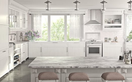
For instance, white is known to be fresh, energizing and calming. Plus, it pairs well with metallic appliances. Red, associated with vibrancy, is known to whet appetite and pairs well with other colors. Gray doesn’t get enough love, as some consider it to be “blah.” However, looking at the bigger picture, it can really accentuate other elements in the space and can be the perfect neutral foundation to build upon.
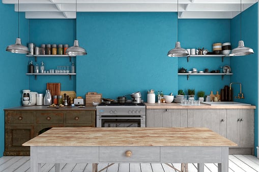
Don’t underestimate the power of blue walls either. Like red, blue, can liven up a kitchen. Just don’t overdo it. If the walls are a dark, rich shade of blue, you’ll want to pull in white, gray and other neutral tones as far as the other features of the room. Too much blue can come across as too intense and even make the area seem smaller.
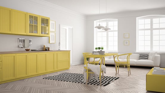
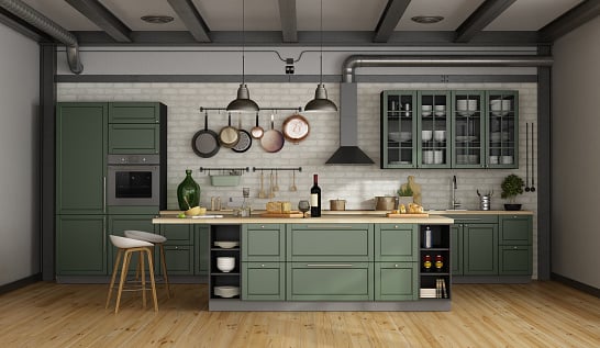
On the lighter end of the spectrum, yellow is brightening and soothing. Another selling point is that yellow can make rooms feel more substantial and it plays well with other accent colors. Last, green is another go-to and it’s a favorite because of its versatility and range. From mint to apple, you really can’t go wrong with green as the primary color.
Feeling inspired yet? Color is a personal choice but there are some general rules of thumb to help you bring your concept to life. Follow the 60-30-10 rule. Divide the colors into 60 percent of a dominant color; 30 percent of a secondary color, and 10 percent of an accent color. The walls will most likely be the majority; the furniture/appliances would represent the secondary color, and accessories such as artwork and anything that adorns the wall, make up the rest.
Other factors should enter the equation, such the color of appliances, countertops, cabinetry, flooring, amount of natural light, etc. If you’re on the cautious side, it’s best to look before you leap, so to speak. Before you buy paint, test sample swatches on your walls and observe how the colors look at various times during the day and evening and how they inform the other elements in the room. You can also use an app like to play around and see how the colors will integrate (or not) into the room.
