.png?width=375&height=150&name=MicrosoftTeams-image%20(63).png "MicrosoftTeams-image (63)")

Courtney Christensen
Have you ever wondered why McDonald’s (and Burger King, In-and-Out, etc.) uses red and yellow in their logo and restaurants? Or why hospitals all have the same seafoam green walls?
Color psychology is used everywhere to influence how you feel about brands or environments. The colors that businesses choose have a specific purpose, and the general ideas can be used in your home, too.Color psychology is the study of color and how it affects human behavior. It is believed that certain colors can influence an automatic feeling or behavior. Like with all behavioral analyses, the idea is torn between nature and nurture. Is color influence a biological phenomenon or is it something we’re taught through our cultures and environments?
Many fast food restaurants use the combo of red and yellow because red triggers our appetite and yellow is friendly. When used together, however, the two colors make us slightly nervous. It makes us want to get in, get our food, and get out quick. Lingering isn't pleasant. This allows these restaurants to serve people quicker. Starbucks, on the other hand, uses a deep green in their branding. In contrast, the green invites us in to stay awhile. Starbucks makes us want to linger. We want to relax, sip our coffee, and usually, get some work done.
So, how does this theory translate to the colors we use in our home? You may not paint your home in the bright bold colors found at fast food restaurants, but adding in pops of color to each of your rooms can affect your mood and the moods of your guests.
Kitchen
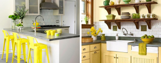
Kitchens are often the heart of the home. They are a natural gathering place, and most of us spend much of our time there. It’s where we make our meals, help our kids with homework, and ask Alexa to play our favorite tunes. That’s why the perfect color for kitchens is yellow.
The color yellow makes us feel energetic and happy. It’s eye-catching. When you include yellow in your kitchen, you invoke feelings of brightness and joy. Your brain convinces you it’s a great place to be. Plus, it’s easy to add pops of yellow to your kitchen, and they don’t have to be bright either.
Using neutrals like white and grey on your walls or cabinets allows you to add pieces of yellow in your decor. It could be a piece of artwork on the wall, furniture (like the stools in the picture above), or linens. If you want to be bolder, you can paint the walls or cabinets with a shade of yellow, too. A bright yellow may be too much, so choose a shade that is duller, paler, or offset with an earthy neutral (for example, the photo on the right). This way, you won’t feel bombarded with such a vibrant color in every direction.
Bathroom
.png?width=563&name=Untitled%20design%20(1).png)
Your bathroom is part of your daily routine. It’s where you go to relax and unwind. In addition to big fluffy towels and a growing collection of bath bombs, add a little color psychology into the mix.
Whether your bathroom is big or small, you can make it feel like a spa just by adding teal or turquoise. This color settles our mood. It takes benefits from both blue and green by making us feel peaceful as well as fresh. It puts us at ease. It’s unique in its ability to make us feel both relaxed and refreshed at the same time.
Most often, you will see this color in a pastel shade, especially in bathrooms. It’s certainly the most common shade used in spas (as well as hospitals). However, bolder colors are becoming trendier. Don’t be afraid to use a richer or bolder teal in your bathroom. Paired with neutrals, it can make quite the statement! The picture on the left above shows a striking teal subway tile wall. The room and furniture are dark. This translates to a subdued and relaxing atmosphere – which is perfect for the person who regularly uses that soaker tub. The half bath, on the right, utilizes white and lighter greys. It’s more subtle but still streamlined and modern.
Master Bedroom
.png?width=563&name=Untitled%20design%20(5).png)
After a long day, nothing feels better than slipping under the covers and getting a good night’s rest. Out of every room in the house, the master bedroom needs to feel the most calming. You need to create a space where you can have downtime that eliminates the stress from your day and leaves you feeling brand new in the morning.
The best way to do this is by utilizing green in your bedroom. Deep green walls are trendy right now, as you can see in the pictures above. Green promotes feelings of safety, relaxation, and revitalization. As an earthy color, green is grounding. To enhance that effect, use wood in your decorating. Wooden furniture, decor, or even an unfinished shiplap accent wall will pair well with green.
If painting an entire room with a deep green isn’t your style, you can incorporate it into your bedroom in subtler ways. Try keeping live greenery in your bedroom. Potted plants do well indoors, particularly cacti or succulents. Crawling ivy can look gorgeous hanging from a high shelf. Larger plants like a potted ficus tree grow tall enough to make a statement without taking too much space.
Living Room
The living room is a natural gathering place. It’s one of the busiest places in your home since it’s used for lounging, binging Netflix, and having drinks with friends. The living room is an inviting and comfortable place to be with family and friends. Because it’s one of the rooms that get cluttered fastest, using a color scheme that allows for flexibility is important. It’s no surprise that the color which suits living rooms best is brown.
Brown is soft and warm. It creates a soothing sort of livability in living rooms. In color psychology, brown represents reliability and safety. Browns work in all shades, too. Lighter browns are easy neutrals that can work with any decor for any personality. Darker browns are more modern and make rooms feel comfy-cozy.
Bringing brown into your living room can be as easy as a brown leather sofa like in the photo on the left. This room uses a very light brown on the walls and adds darker brown accents to create a farmhouse look. The room on the right is monotone which lets you make seasonal changes by using statement pieces. Throw pillows and unique abstract art put the room together without looking boring. If you have an open floor plan, using a large rug can help define the living room so you can transition to another color scheme in the other spaces.
Playroom
.png?width=563&name=Untitled%20design%20(3).png)
Let’s be honest, kids are going to use every room of their home as a playroom. But, maybe you’re lucky enough to have a designated space to corral your kiddos and their toys. Your kids aren’t looking for sophistication or clean lines in their playrooms, so you don’t need to be as strict with your decor and design here. Have some fun with it!
There aren’t many colors more fun and quirky than orange. According to color psychology, orange is stimulating. It encourages people to express freedom in their creativity. It’s hard to be sad in an orange room, especially one that is decorated with whimsical art or off-the-wall furniture.
If you’re feeling brave enough, paint the entire room (or just an accent wall) bright orange. The two images above both use simple white on most of the walls and reserve one wall for a bold orange. White furniture is used in both of the rooms as well. It may seem difficult to find decor pieces to match an orange room, but that’s not the case! The room on the right uses every color of the rainbow in their decorating. The playful use of textures and colors pull this room together. It looks bright and inviting. There’s no doubt that the kids who use these rooms feel downright giddy in their unique spaces.
Office
.png?width=563&name=Untitled%20design%20(7).png)
The home office fills many roles. You may use it for your career or side hustle. You may use it as a home library. Maybe it’s a gaming room or where your children do their homework. Whatever it’s used for, the office needs to help you be productive. You should feel both focused and relaxed. One color that can accomplish this is dark blue.
Just like light blue relaxes us, so does dark blue. Unlike its lighter shade, though, dark blue represents order, responsibility, and security. This makes it the perfect color for a home office. Color psychology says that we can manipulate our brains into being more productive and orderly by painting this space in a shade of navy.
Dark blue can work in any sized room, as you can see in the photos above. To help keep the dark color from overtaking your room, mix it with lighter colors like white or cream. Mixing in textures like soft blankets or wooden accents also help keep the room from looking cold and impersonal.
Guest Bedroom
-1.png?width=563&name=Untitled%20design%20(4)-1.png)
You know that feeling you get when you first open the door to a nice hotel room and you’re greeted with the sight of a big bed and overly-filled pillows? There’s interesting art on the walls. The furniture is unique. It’s new! It’s different! You want to give this same feeling to your own guests. Your guest bedroom should make your guests feel charmed and comfortable.
It’s not an often-used room, so feel free to get whimsical or adventurous (or both!) in this room -- use purple. Unlike teals, shades do matter when it comes to purple. A deep and rich purple is often associated with royalty. Softer shades, though, bring to mind relaxation and coziness.
Like with any room of your home, mixing colors with neutral tones helps to balance the space. Both the rooms above use whites and greys to give the bedrooms a sophisticated look with a touch of playfulness. The room on the right is more purple-heavy while the one on the left relies on simple decor pieces to achieve the final comfy look.
Dining Room
.png?width=563&name=Untitled%20design%20(6).png)
Thanksgiving, birthdays, dinner parties, or a typical nightly dinner -- our dining rooms see a lot of action. Dining rooms aren’t just for eating. They’re hubs of conversation and laughter. Some rooms are more formal than others, but all dining rooms can benefit from the color red.
Red is perfect for dining rooms because it stimulates both conversation and our hunger. Like I mentioned earlier, red is often used in restaurants because of its unique ability to give us the munchies. The psychology behind the color red is that it raises our energy levels, our appetites, and our metabolism. It is also known to raise blood pressure, too.
There’s no such thing as a subtle red. But, the color can be used in a big way or a small one. In the picture on the right, the entire room is painted red. It’s offset with whites and creams. This gives the room clean lines so as not to let the red feel overpowering. In the left picture, red is used sparingly. It’s used in the linens - the curtains and the napkins. You can see red flowers, and also a bit of red in the art on the walls. So even though the room itself is grey, the red draws your eyes to it immediately.
Whatever room you're redecorating, remember to incorporate a bit of color psychology. Bright colors may be out of your comfort zone. But now that you know how they'll affect you, take a step out of your box and liven up your home! You may be surprised at the results.
